Docs/Builder Documentation/Option Builder
Option Builder
Create a panel, add sections/rows, drop fields, configure each one, save. A worked example of the same panel this page builds: Tutorials → Build a Theme Options Panel.
-
Create a panel
Go to Pure Fields → Option Builder → New Panel. Start blank, from a starter template, or import existing code (see Migrate from Kirki / Redux). Set the panel title, menu slug and icon under Panel Settings.
-
Add sections, rows & fields
A panel holds sections (tabs); each section holds rows; each row holds fields in a 1–4 column grid. Click Add Field, pick a type, and configure its Label, ID, default, options and conditional show/hide rules.
-
Optionally output CSS automatically
Color, typography, spacing, dimension and gradient fields can carry Output CSS rules (selector + property). With the panel's CSS output on, the saved value is injected into
<head>on the front end — no template code needed. -
Save & (optionally) show in Customizer
Save to persist the panel. Turn on Customizer integration in panel settings to mirror it into Appearance → Customize — see Integrations → Options Pages.
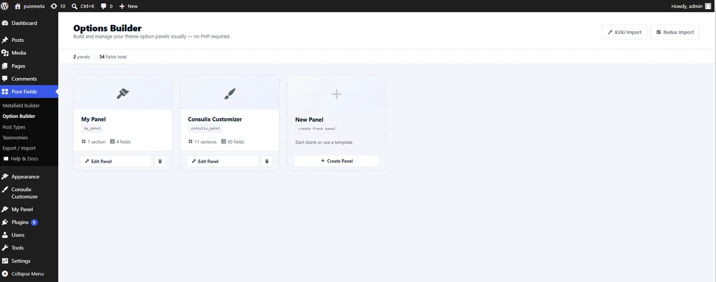
opt_name, section and field counts. Kirki Import / Redux Import sit top-right; New Panel starts a fresh one.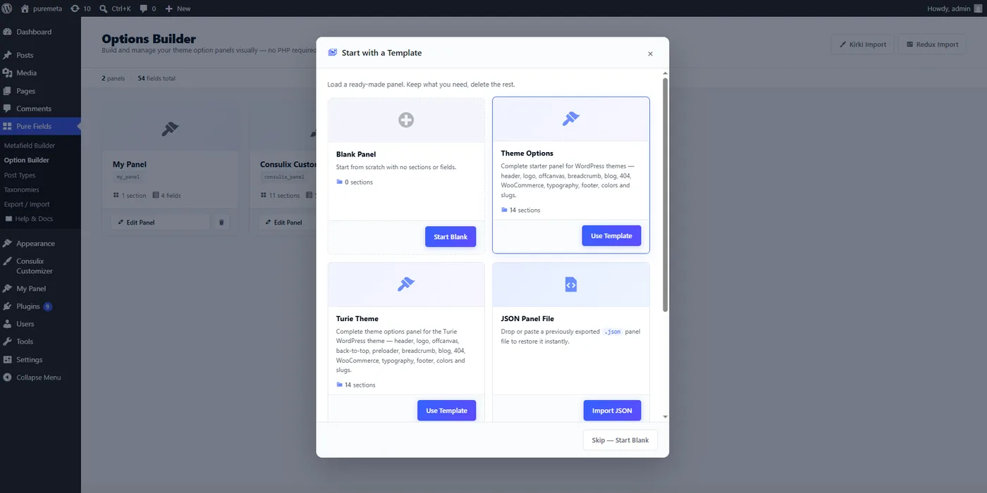
.json panel file to restore it.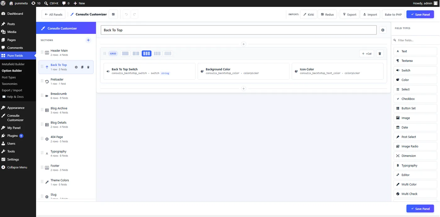
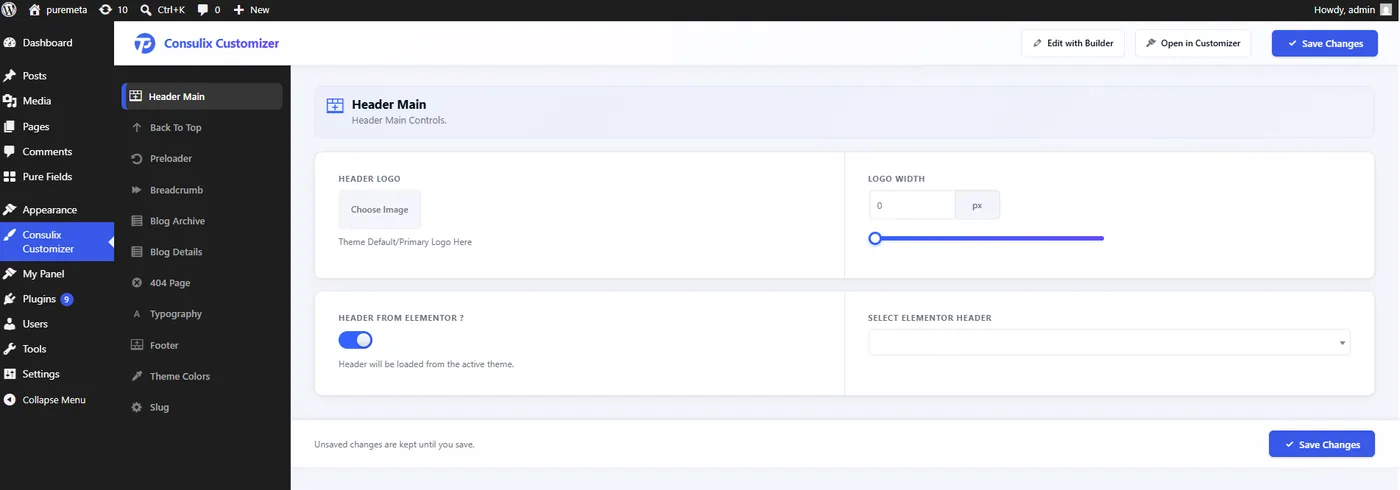
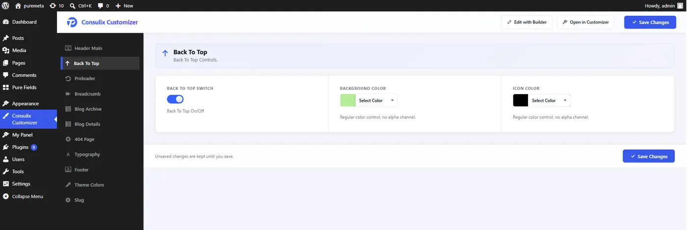
switch with two colorpicker fields — read with tpmeta_get_option().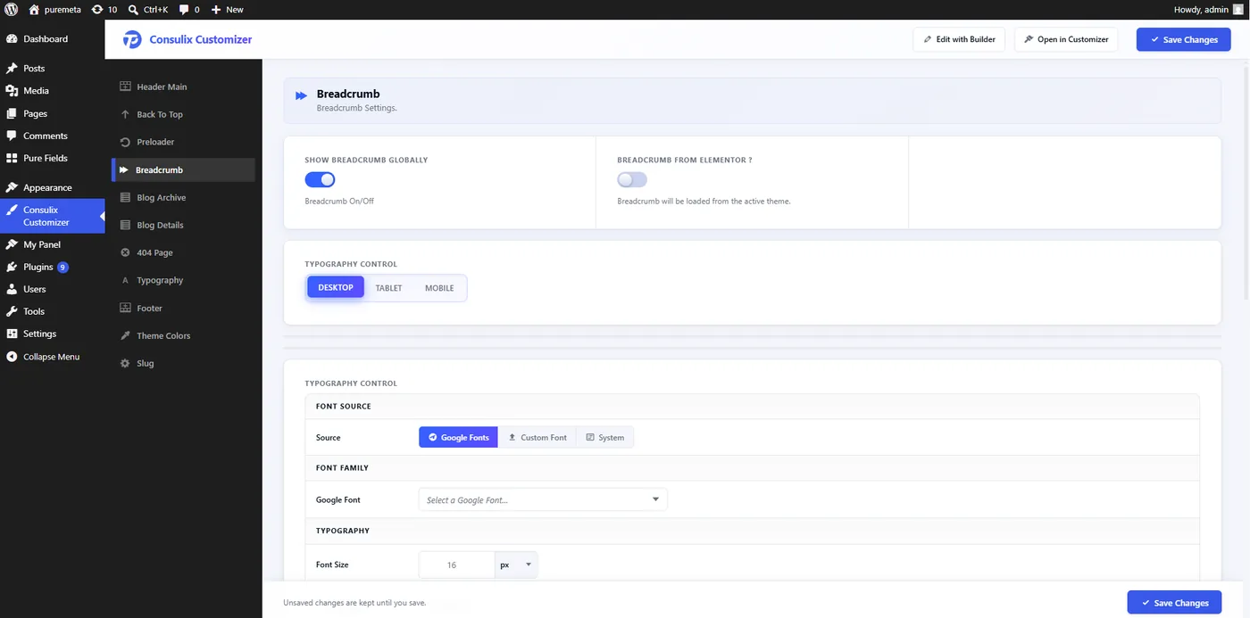
typography control (Desktop / Tablet / Mobile), a font-source radio_buttonset, and on/off switches.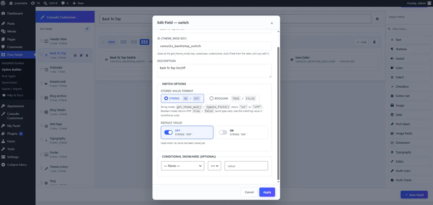
switch field — its ID (the theme_mod key), description, stored-value format (string on/off or real boolean), default and conditional show/hide. The Field Types palette is on the right; section navigation on the left.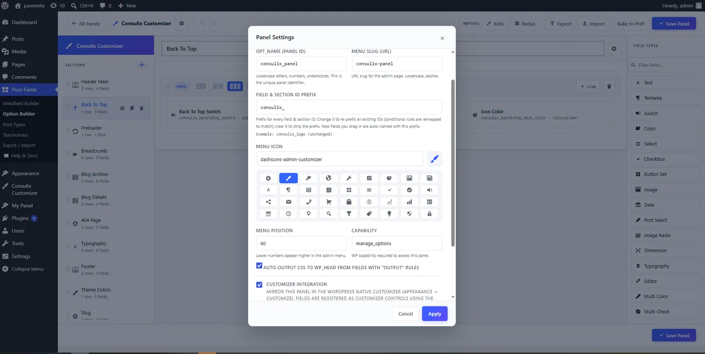
opt_name, menu slug, field-ID prefix, menu icon, position and capability — and tick Customizer integration to mirror the panel into Appearance → Customize.The repeater field lets editors add unlimited rows of sub-fields (text, color, image, gradient…). It is fully supported in both builders and in the Customizer. Reading it back: Developer Guide → Helper Functions.